June 27, 2013

Nail Polish Confession Time!

I that I'm [tragically] having some technical difficulties.  My main computer has some sort of hardware issue I'm currently trying to diagnose and fix.  Because of that, I don't really have access to swatch photos or editing software at the moment.  (For the time being, I'm working off of a reaaaally slow laptop.)

So, I thought it was time for this little post, which has been brewing for a while-

Welcome to nailpolish confessions!


1) Yellows scare the crap out of me.  There are some beautiful ones out there, but out of a collection of about 500/600-ish? polishes (I don't really want to know the number!), I can count my yellows on one hand easily: China Glaze- Lemon Fizz, Color Club- Daisy Does It, and China Glaze- Trendsetter if you want to count that.  I have very light, pinkish, cool-toned skin, and yellows are just generally unflattering.  I love the way they look against dark skin, though.

2) I don't "clean-up" with a small brush and acetone like you're "supposed" to.  My cuticles are dry enough as it is (between my job and guitar playing), and it's a constant battle to keep them hydrated enough for up-close-and-personal photos.

I just try to paint neatly in the first place, and basically follow this technique:


(Photo Credit: Lacquerized.com)

Starting below the cuticle and then pushing the polish upwards (step 4) is really key for me; it helps create that neat-looking arc, and really steadies the hand.  I also make sure to rest my wrist on my worksurface. And, of course, practice is key!

Sometimes I will use a correcter pen, like the one Sally Hansen makes, if there is some egregious mistake, but that is usually underneath the nail, especially as a result of wrapping the tips, when my nails are shorter.

3) I'm a packaging snob.  I can't help it- I just like good design, and crappy packaging can turn me off of even really pretty colors.  A lot of times this happens with indies, and I'm not afraid to admit it. I don't want polishes with labels that look like they were printed by a 1995 inkjet, and then glued on at your grandma's house- especially if I'm paying upwards of $10 for them!

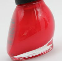
A commercial big offender for me is the Nicole by OPI packaging.  The bottle is horrible- you turn it to the side and suddenly:

(Photo Credit:


I don't own a single NOPI because of the bottle shape.  Am I missing out?  Maybe.


4) Having just one of any brand makes my eye twitch! Call it OCD, but I feel like a single polish of any one brand gets lonely.  And, it's hard to get a sense of a brand with just one polish. This neurosis also works as a sort of polish-buying chastity belt; I'll refrain from venturing into the unknown territory of new (to me) brands for a long, long time, if I don't already own some of said brand.  Does it make sense?  Not in the least!

5) Nail Clippers! I totally use them if I need to take down significant length, and not just shape/refine.  I know you aren't supposed to use them, but ever since I began using nail strengtheners and taking Biotin, my nails seem to handle clipping pretty well, and I just don't have the patience to sit there with a file for two hours.


So- what are your nail care/ polish confessions?  Any weird habits or tricks out there? 
Let me know!


Bonus:


Ham's nail confession is that his claws are always way longer than I'd like!  He's a big derpy baby about letting me cut them, and it can only be accomplished with a steady stream of dried liver treats. 

June 22, 2013

Simple Vertical Stripes [Nail Art]


I realize I don't do enough nail art, so I'm going to try and attempt at least one nail art-ish thing per month from now on!  Mostly, I just like wearing polish by itself, to appreciate it.  Then, usually, if I get bored, I'll throw on an accent nail or two to keep things interesting.


This manicure is just simple messy vertical stripes, as you can see. It was my first attempt doing stripes like this, and was done without guides or nail tape.  They don't look great in photos, but looked okay in real life.  Funny how that works.


The base color....I'm not sure what it is, to be honest.  I did these a month or two ago.  It might be Zoya- Wednesday, or something similar- I'm not sure.

The white stripes were done with a nail art striper: the white one that Sinful Colors makes, to be more specific. It has quite a thick brush for striper, so my stripes turned out pretty thick.  I ended up liking it though.


June 19, 2013

Orly Mash Up Polishes [Swatch] & [Review]


Here is half of Orly's Summer 2013 Mash Up release.  I know most people think the star of this collection is Sparkling Garbage, and maybe it's because I haven't seen it in person, but it didn't appeal to me all that much!

Anyway, here are three that did! 

First up is Orly- Beautiful Disaster:


Beautiful Disaster is described as a "magenta chrome," and that's not too far off, although I don't necessarily think of the finish as a chrome.  It's got a lot of fine shimmer, though.


The base is a red-toned purple, and the shimmer is much cooler toned, which makes the overall appearance of the purple more blue-based, and contributes to a duochrome-y quality in photos.  This does photograph much warmer than it looks in reality.

Artificial light, two coats:


Window-filtered daylight:


Outside, shade:


The above photo is probably the most color-accurate.  You can see how much the shimmer changes the overall tone of the polish.


Formula: Was easy to apply, except that I encountered a lot of trouble with bubbling.  I tried a few different basecoats underneath, thin coats, thick coats, and everything else I could think of, and still couldn't achieve a bubble-free application.  I really don't know why, but the swatches that you see are the best attempt (and oddly-enough, the bubbles aren't really visible).
--


Next, is Orly- Pretty-Ugly:


I'm not sure what's up with the name, but there's not really anything ugly about this color.  I think this shade will appeal to most people who are already comfortable stepping out of the "red-pink nail polish zone" (the RPNpZ!).


Anyway, Pretty-Ugly is a green-tinged blue base with lots of fine, bright aqua shimmer swimming in it.  It's not terribly unique, but I don't think I own a dupe, either.

Artificial light, three coats:


Window-filtered daylight:


Outside, shade:


Formula:  It's definitely on the thinner side, and very sheer.  The first coat is streaky, and I needed three to even out the patchiness. By then it started to get gloopy, although it still self-levelled. Pretty hard to explain!    So, not my favorite formula ever, but also not the worst, since it was ultimately workable.
--


Last is my favorite of the bunch, Orly- Mayhem Mentality:


Mayhem Mentality is a day-glo neon orange.  It is insanely bright!

It dries ever so slightly darker than bottle color, but that will not be apparent in photos, and did not bother me in the slightest or detract from my enjoyment of this color!


I was on the fence about this polish, because I already had a bright orange that I loved, Illamasqua- Gamma.  I was relieved to discover that the two are not dupes! Mayhem Mentality is brighter, if you can believe that, and also has more pink in it, while Gamma seems to be more yellow-based.

Artificial light, three coats:


One certainty is that this color will be finding its way to my toes soon!

Window-filtered daylight:


Outside, shade:


Unngh.  If you're looking for an affordable neon orange, this should be your port of call!

Formula: It's thick and sliiiightly chalky. The first coat is streaky, since it doesn't self-level very well at all, but that is to be expected from a neon shade like this.  Be careful not to overwork this one, or cuticle-drag happens.  All that said, it's very decent after three coats, especially for a color like this, and I was expecting a lot worse actually. I do wish it would self-level better.
--


Overall, these are great colors for Summer, and I like the idea of a "Mash Up" collection containing various finishes and shades that aren't necessarily cohesive.

However, I encountered minor difficulties with all of the formulas, which is a shame, since I really want to love Orly. Don't get me wrong, these aren't horrible, and maybe the formulas on the other half of the collection are better?  Maybe I expect too much?!

June 16, 2013

Depotting Everyday Minerals Travel Size Mineral Eyeshadows


And now, for something else non-polish related!  This is just a simple step-by-step overview of how I depotted some Everyday Minerals "travel size" mineral (loose) eyeshadow into small sifter jars.  It's too simple to be a real tutorial, but it was fun to do, so I thought you all might like to see.


This is how the normal mineral eyeshadows come- in big size (1.7g) and mini (.57g).  These are really nice shadows, and Everyday Minerals is a great company in general, I think. (I also use their mineral face base, and quite a few of their eyeshadow brushes on a regular basis.)

However, if you've ever worked with mineral eyeshadow before, you know how messy it can be.  That's the only real drawback.


And, here's the travel size shadows that I'll be working with.  They come in a tube with a rolley ball dispenser on the end, which is supposedly good for on-the-go eyeshadow application or touch-ups.  A good idea, in theory, but not execution. (And, I believe they have since been discontinued.)


You can see that it looks pretty messy already.


However, one of my biggest problems with this packaging is that each rolley ball has a plastic seam which is terrible to be dragging across the delicate skin of you eyelid.  You may be able to see that above.  Additionally, rolling these on created a lot of fall-out, and they still need to be blended in anyway, so the "travel" packaging just didn't work for me.


Another thing was that a couple of the caps had begun to crack for whatever reason.

So, let's get to it.  Here's the supplies:


First, some 3 gram sifter jars.  I got these from eBay, and they come in all kinds of sizes. 3g was the smallest I found, and they worked out perfectly.


Some round labels (mine came with the sifter jars), pliers, and a pen or something to write with.


It'll be helpful if the pliers have a grippy texture like above.


I went ahead and wrote the shadow names ahead of time.

And, of course, the empty sifter jars:

The sifter is a little piece of plastic that just pops out.

So, it's very simple-


The rolley ball is attached inside a plastic flange-like piece and you can just gently pry it out.


I found that it works best to twist (rotate) it back and forth a little.  They pop out fairly easily this way, and you're left with an open cylinder:


Also, welcome to my naked nails here! It's rare that I'm not wearing polish, but I was between paint jobs.

Then, you just carefully pour into an empty sifter jar (after removing the sifter piece).


I had to shake and tap the tube/ cylinder a little to get all of the shadow out.


Very messy, but what can you do?

Then you pop the sifter plastic into the jar, and depending how much shadow I had used (this one, not very much) some will fluff up through the sifter, which you can either discard or keep within the jar:


Then, I just stuck the label on the back.  Easy.

Here's how Ham "assisted" during the whole process:


melted, lazy, sack-o-meat

And, a shadow in its new container:


You can see they look pretty similar now to the normal mini size Everyday Minerals packaging:


And, of course, the aftermath!


Needless to say, this project was very, very messy.  It's important to work over something disposable or something that can be cleaned.  (That's a drawer from a Muji acrylic container.)  You will lose some small amounts of eyeshadow during depotting- it's pretty much inevitable.

The final result!


The whole project took about 45 minutes, and was fun to do!

I feel like I can see the colors so much better.  I'll also be able to use these more easily with eyeshadow brushes.  They'll still be messy, but there won't be awful packaging to wrangle with, and I'll be able to use them like normal shadows! Hoorah!

Newer Posts Older Posts Home